Hi! My name is Ian Jun Wei Chiew, Lead Concept Artist at Sucker Punch Productions, and I was fortunate enough to have worked on Ghost of Tsushima since the very beginning. Ghost of Tsushima is set in 1274 during the Kamakura period, which comes with a lot of challenges as well as interesting opportunities to explore visual designs for the game.
Our main story inspiration was the Mongol invasion of Japan of 1274, and the main character was a survivor of that invasion who defies all odds to defend his homeland. This was the core player fantasy that served as an overarching guide for everyone at the studio. We began by exposing ourselves to as much research and content as we could on the Kamakura Era, Japanese culture, old Samurai films and the Invasion of Tsushima, which led to the final designs of our characters, outfits, landscape, architecture, etc. A lot of the references we gathered were from museum exhibits and photos taken by teams that the studio sent out to Tsushima as well as the main island of Japan.
Characters
We spent a lot of time gathering reference material for our characters, which ranged from Samurai films, online books and resources, to photographing museum exhibits, from the most intricate Samurai and lavish armor, down to poor and rough bandits. Usually the concepts for characters are done well before the actors are cast. We try to invoke a personality fit for the character on the face as well as provide references for the general tone the character should give off. This helps with finding and casting the actors later. Once the actors are cast, we fit their faces onto the outfit designs and from there they do an amazing job capturing the personality and nuances of the character through their lens. The general process was to get a brief narrative of the character, doing research and reference gathering, coming up with some thumbnail sketches, rounds of iterations, and reworks to address any technical issues we faced.
Jin and His Allies
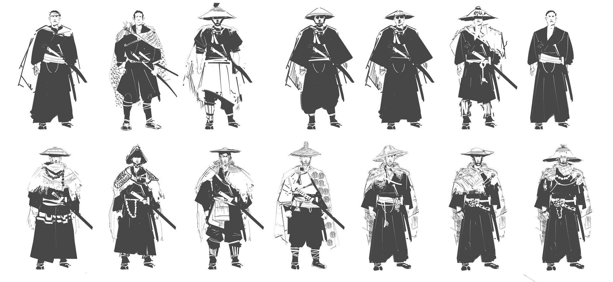
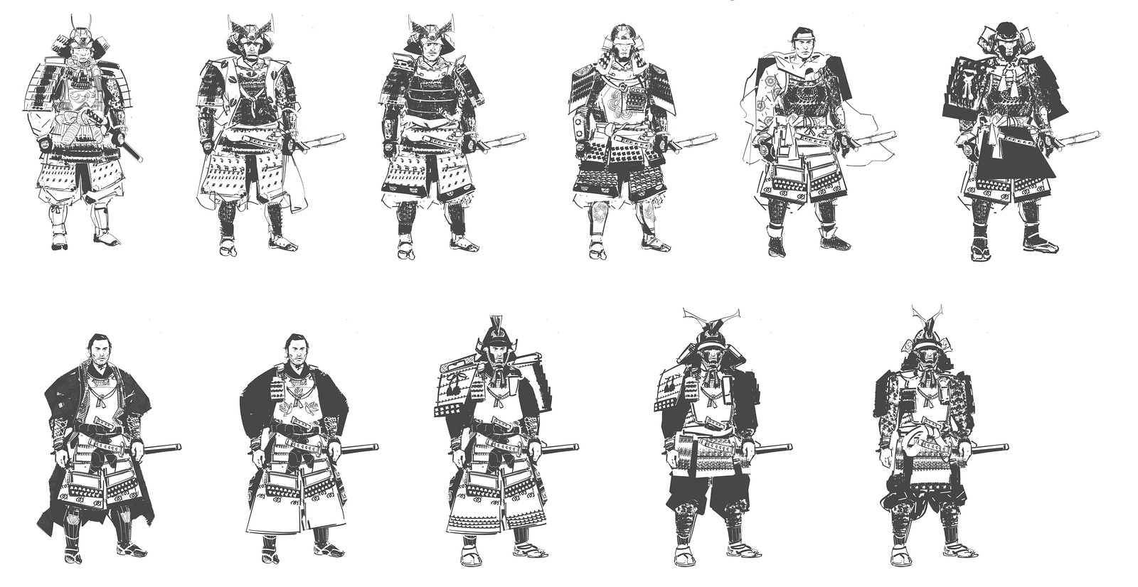
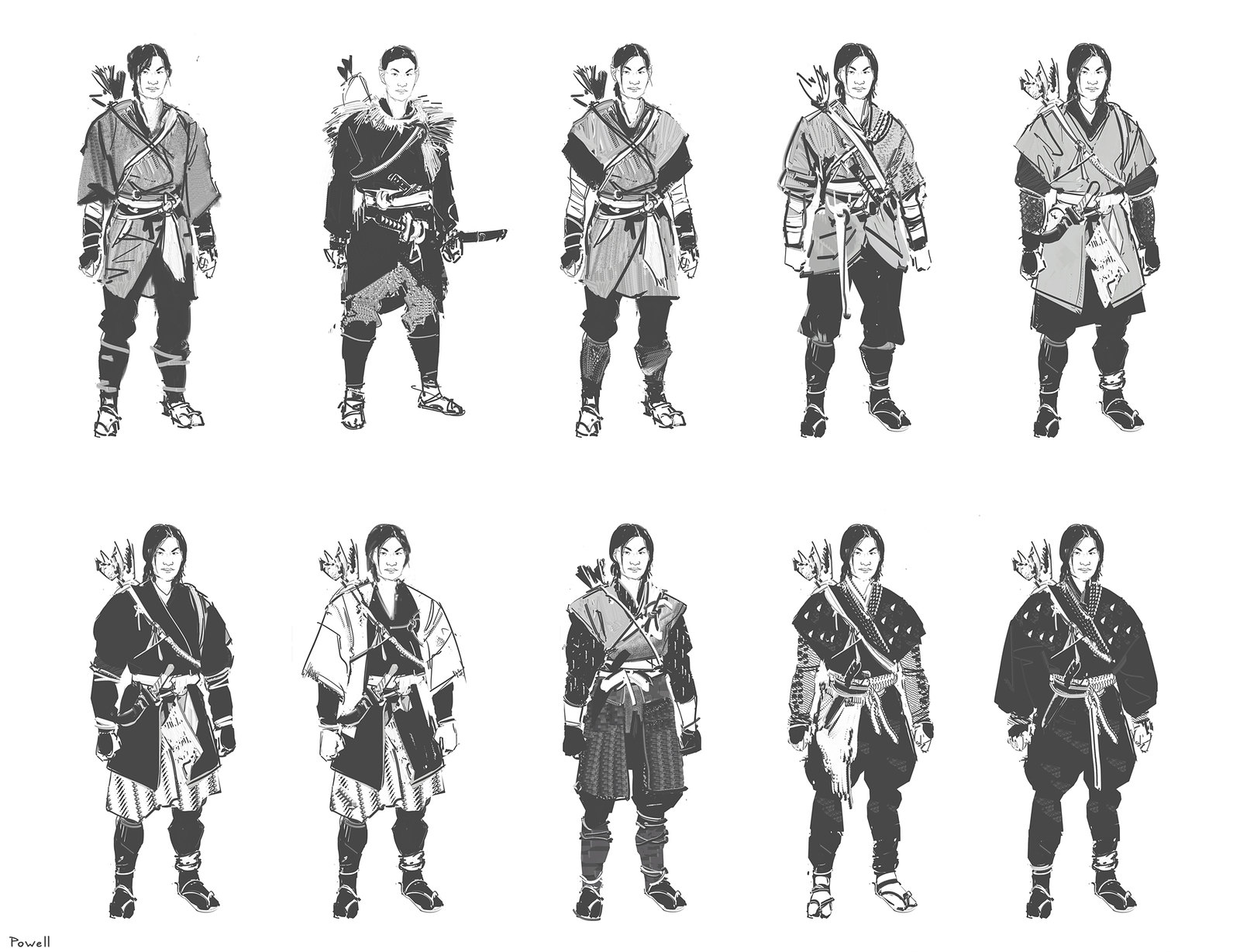
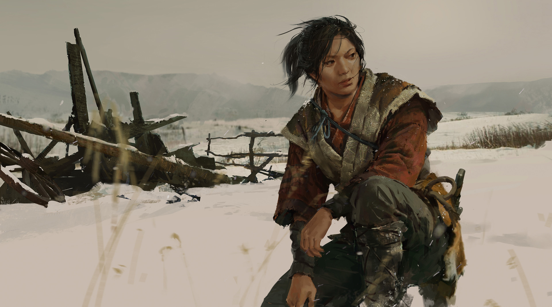
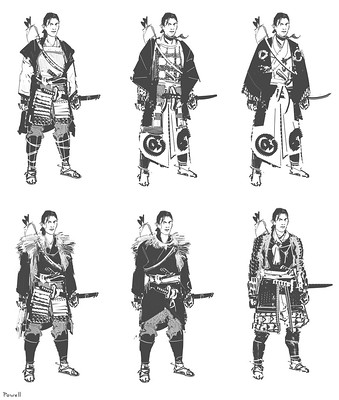
In the early drawing boards for Jin, we knew that we needed someone that can fulfill the fantasy of hiding in the shadows, but still having a look that feels like it was inspired by some of his samurai armor and aesthetic. While there are some stealthy assassins that actually appear from various points in history, there wasn’t a lot of information about the first warrior of that kind. Knowing that we wanted a character to have to let go of tradition and evolve into something out of necessity gave us this opportunity to tell a fictional story of a new kind of warrior. We avoided going the route of your traditional assassin trope with the iconic black and fully cloth-based outfit, and instead incorporated a touch of samurai armor elements in the Ghost outfit to help add a sense of realism. Jin’s arc of turning from the honorable samurai to the new dishonorable warrior was portrayed by including subtle intricate patterns as well as traditional armor plating pieces to make the Ghost outfit look more believable for that time.

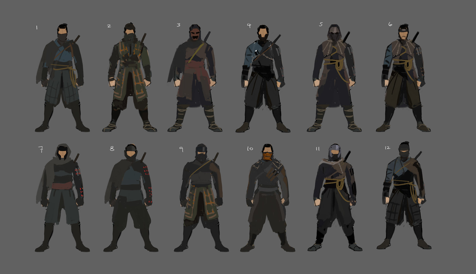

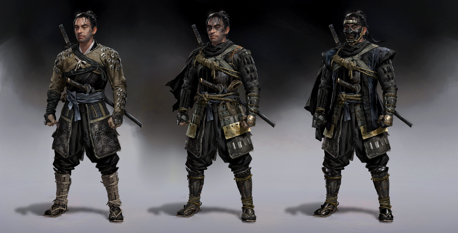
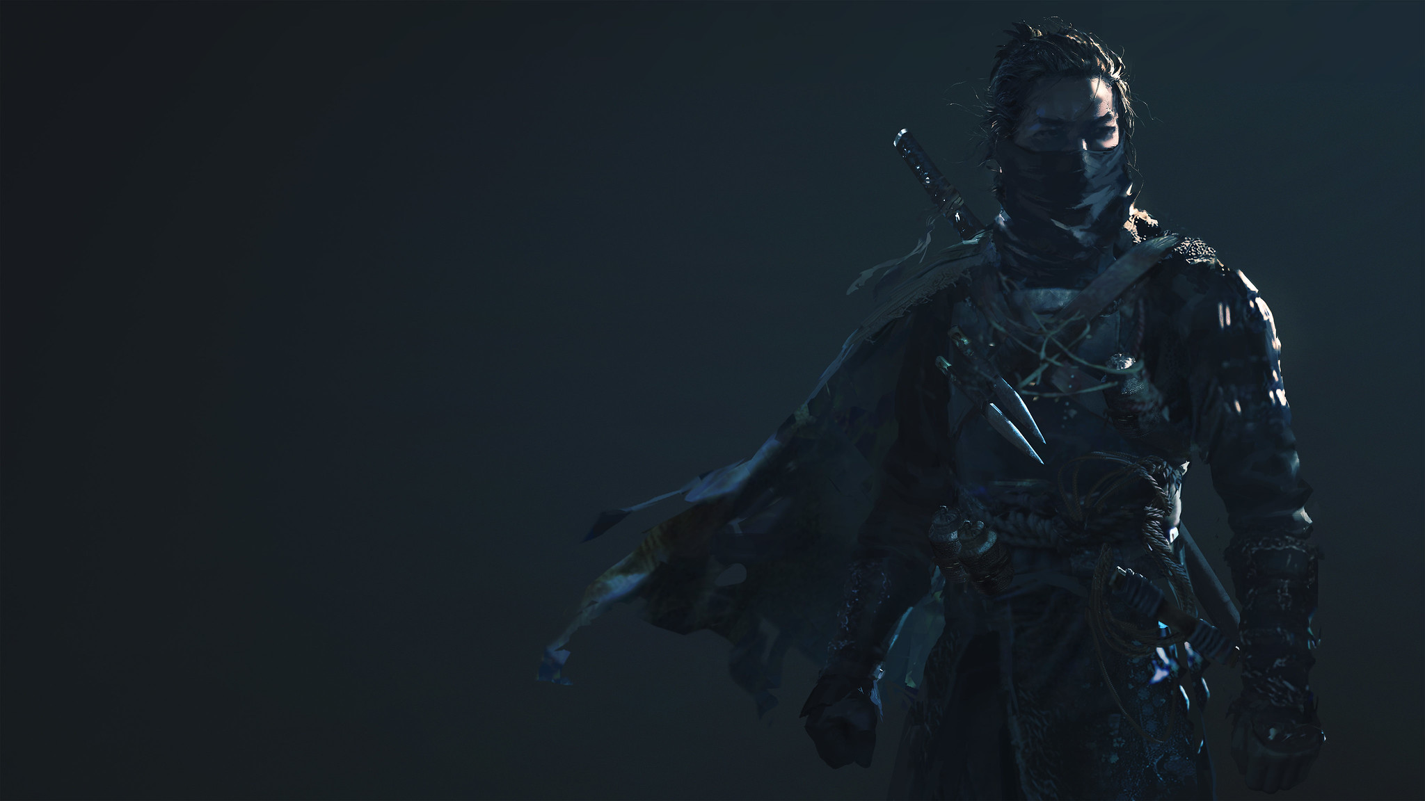
For Jin’s more traditional samurai outfits, we looked closely at armor references from the Kamakura and Heian periods. Those radiated a sense of regality which fits Jin’s arc and contrasts well with the dark and muted scheme of the Ghost armor. We started off with Jin as a full-fledged samurai, then a broken samurai, and then to be reborn as the Ghost. The bulky and angular shapes from the traditional samurai armor contrast well with the more light and agile make of the Ghost armor.

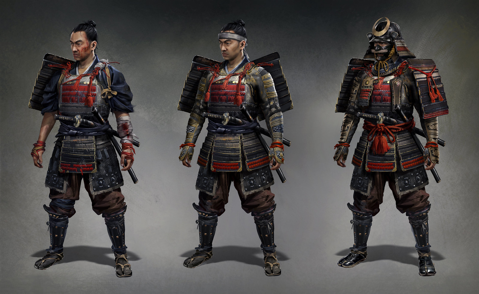

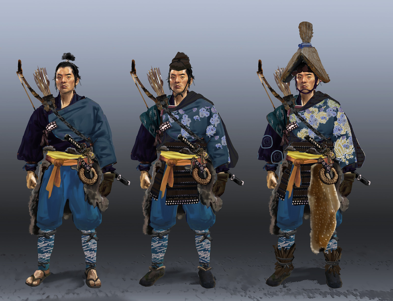
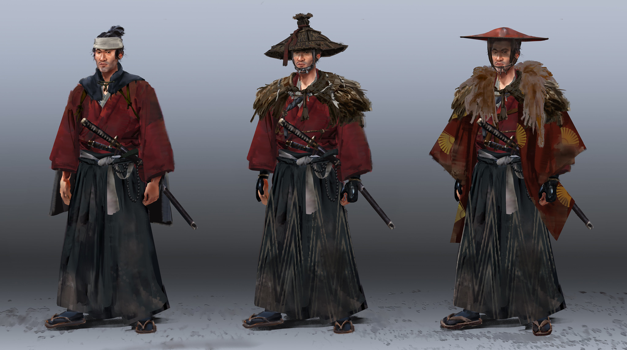
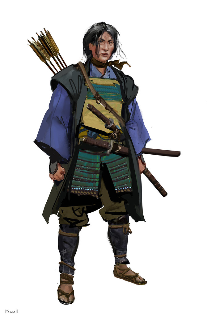
We also created a lineup of outfits that Jin can acquire throughout his journey, and for these, we had a bit more creative freedom in designing outfits that helped sell the samurai fantasy, such as Tadayori’s Armor, which was inspired by Yabusume (traditional Japanese mounted archery). The more cloth-based outfits such as Kensei and Traveler’s outfit were designed with the intent of making the player feel like a lone wandering ronin, just like in those old samurai films. Since the wind plays a big part in our game, we made sure to always have parts of the outfit that reacted to the wind, such as capes and tassels. This helps make the characters feel more connected to the world.


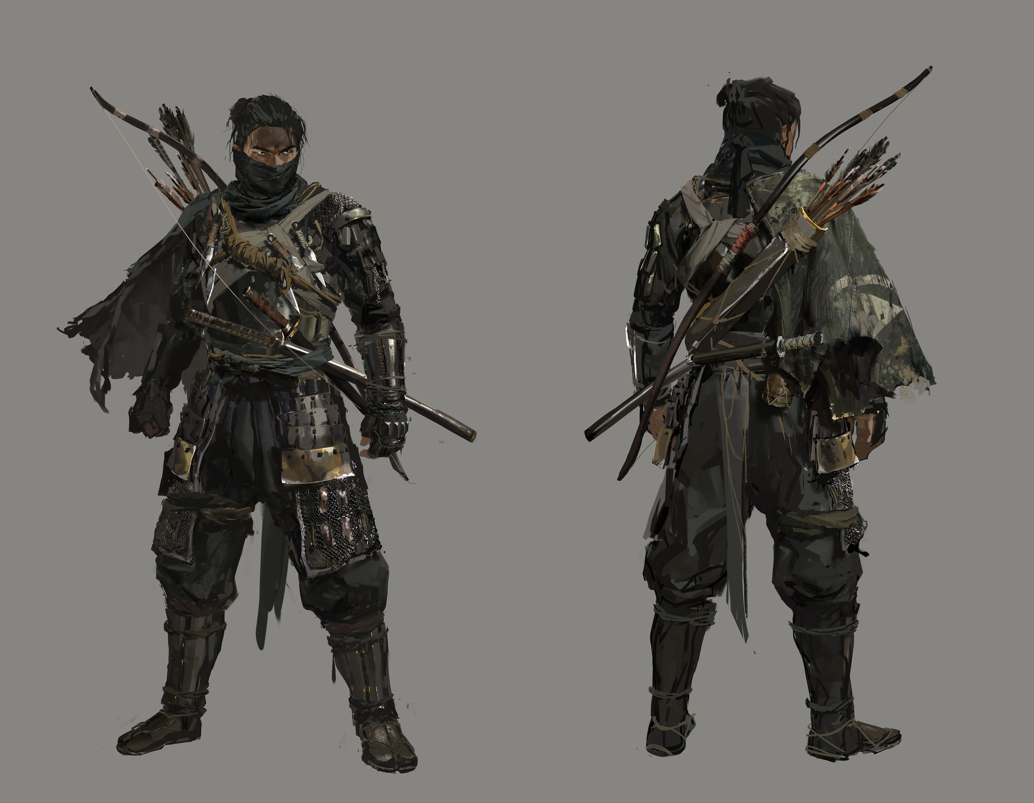
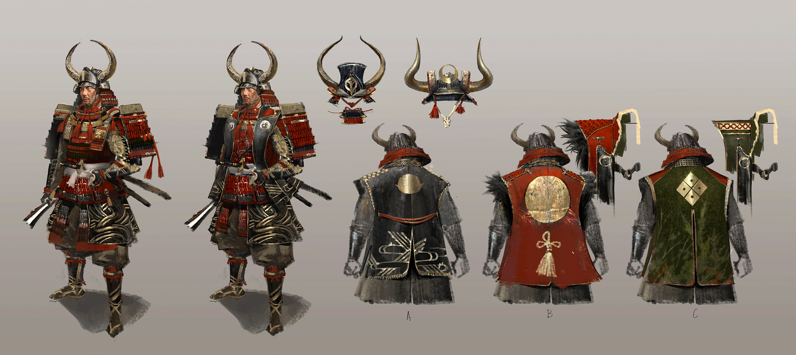
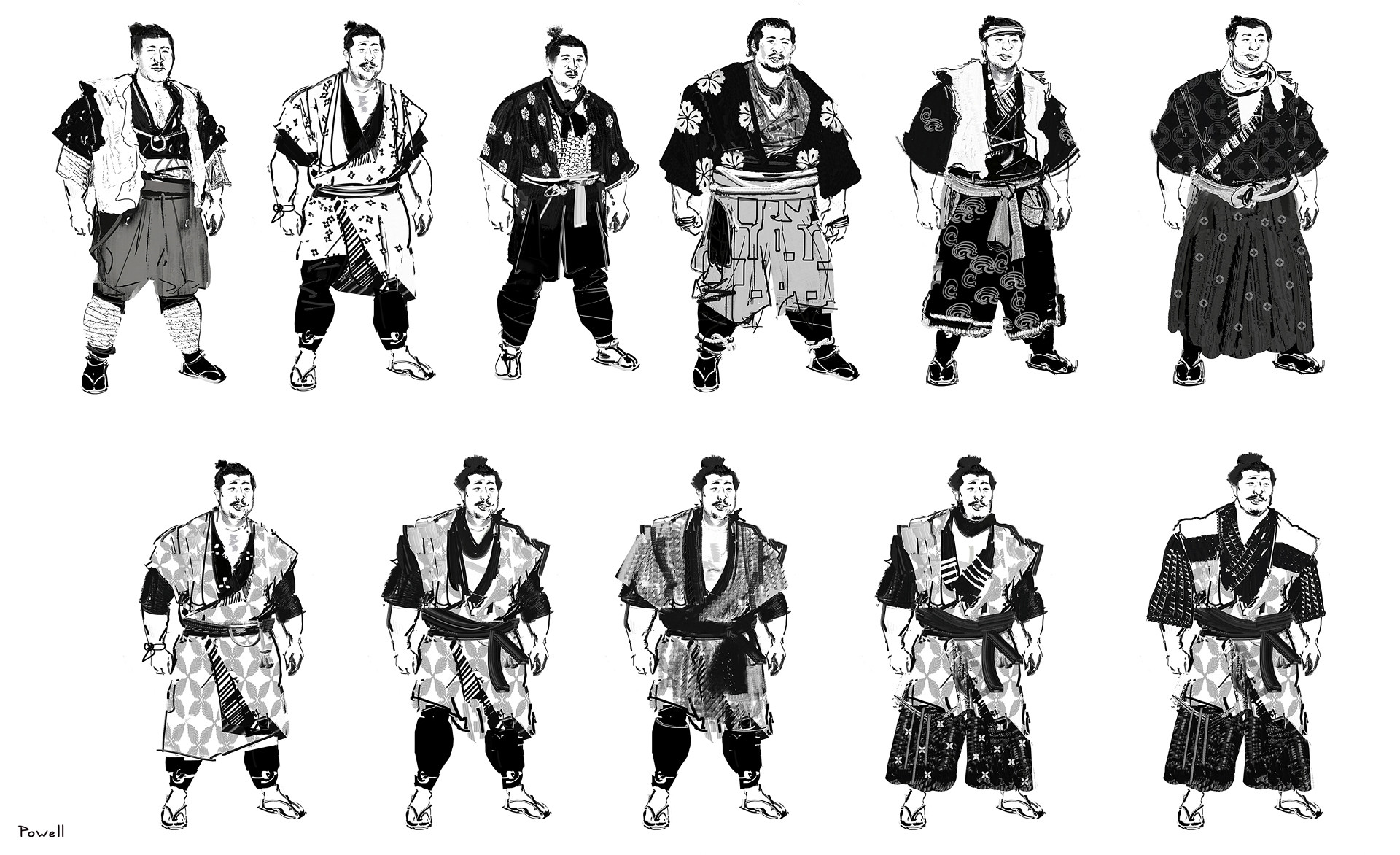
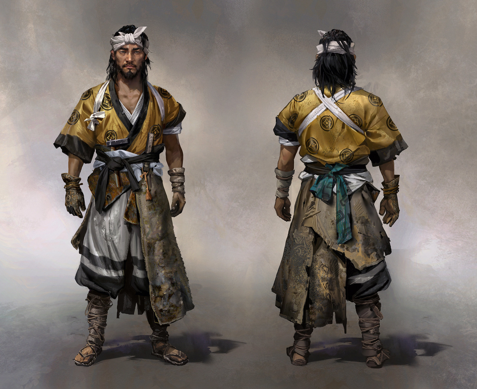
We went through the same process with our other primary and secondary characters. A lot of intricacy and thought was given to each side character, just like our main cast. From the ornate pattern of Shimura’s armor to the scarf and cloudy patterns for Yuriko, which hints at her fading memory.


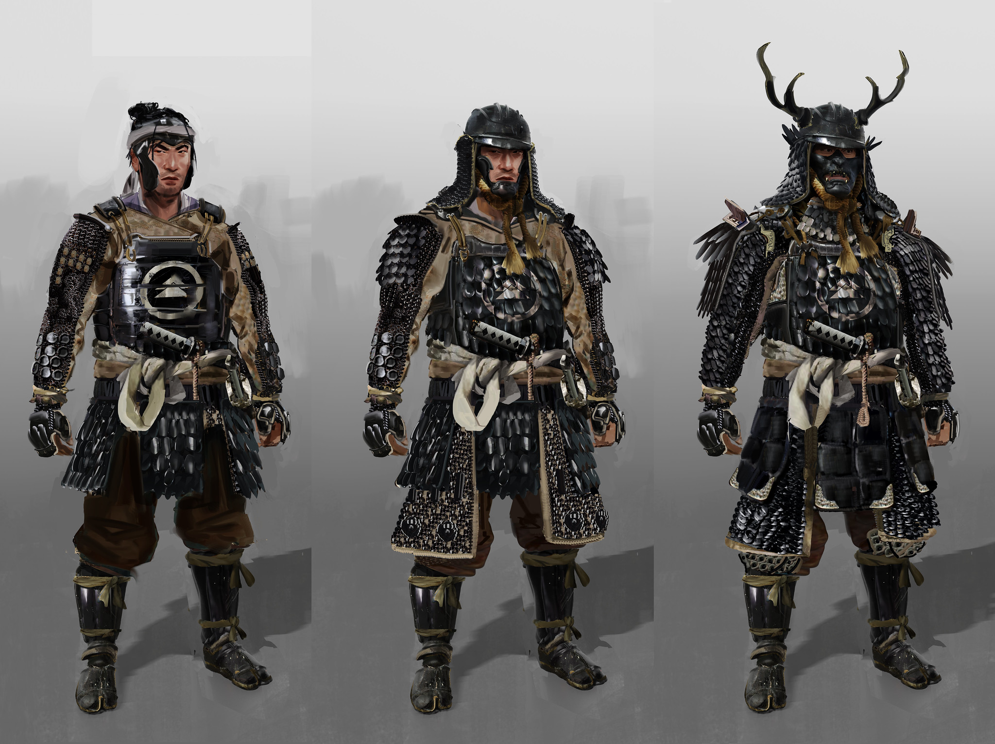
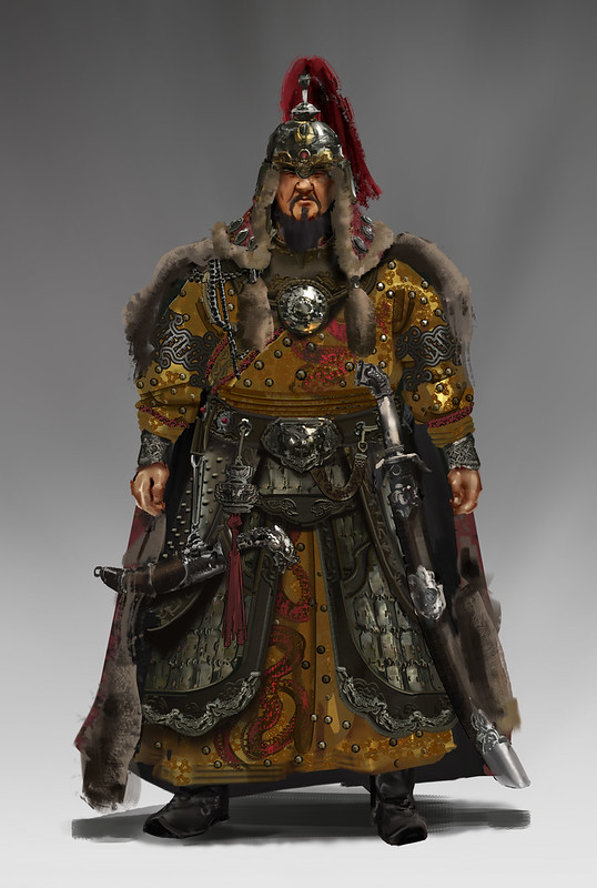
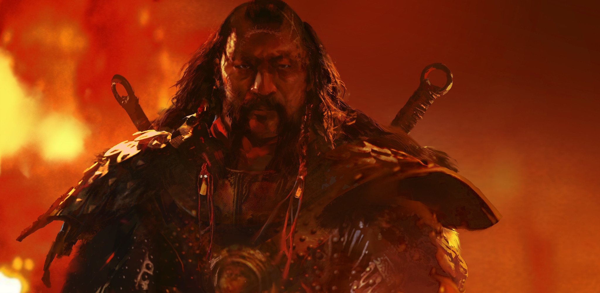
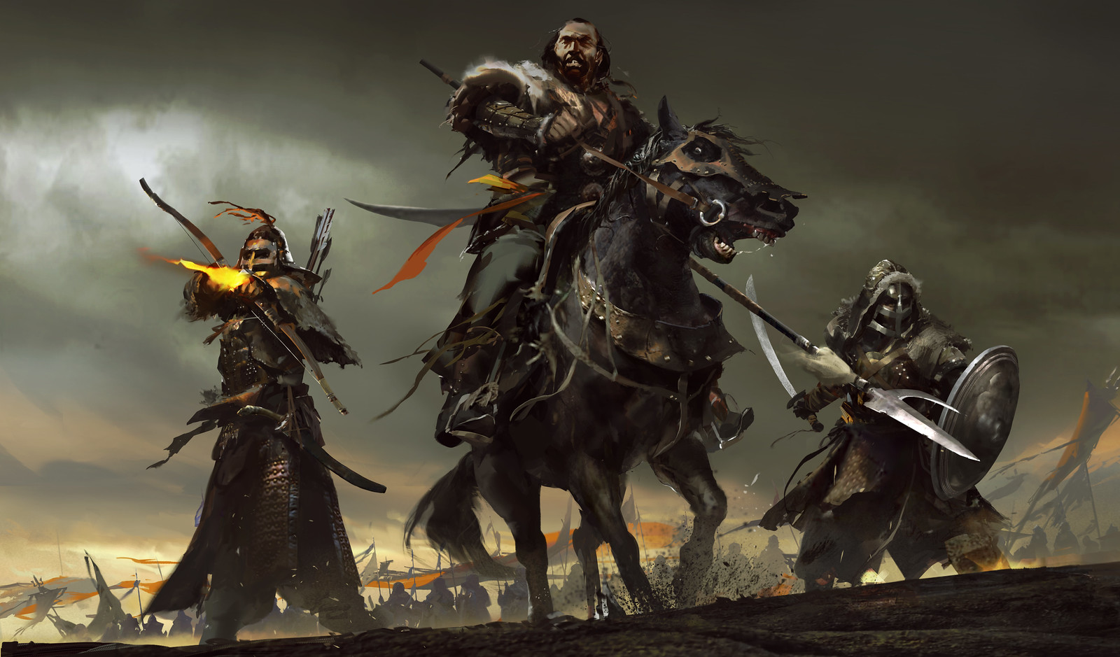
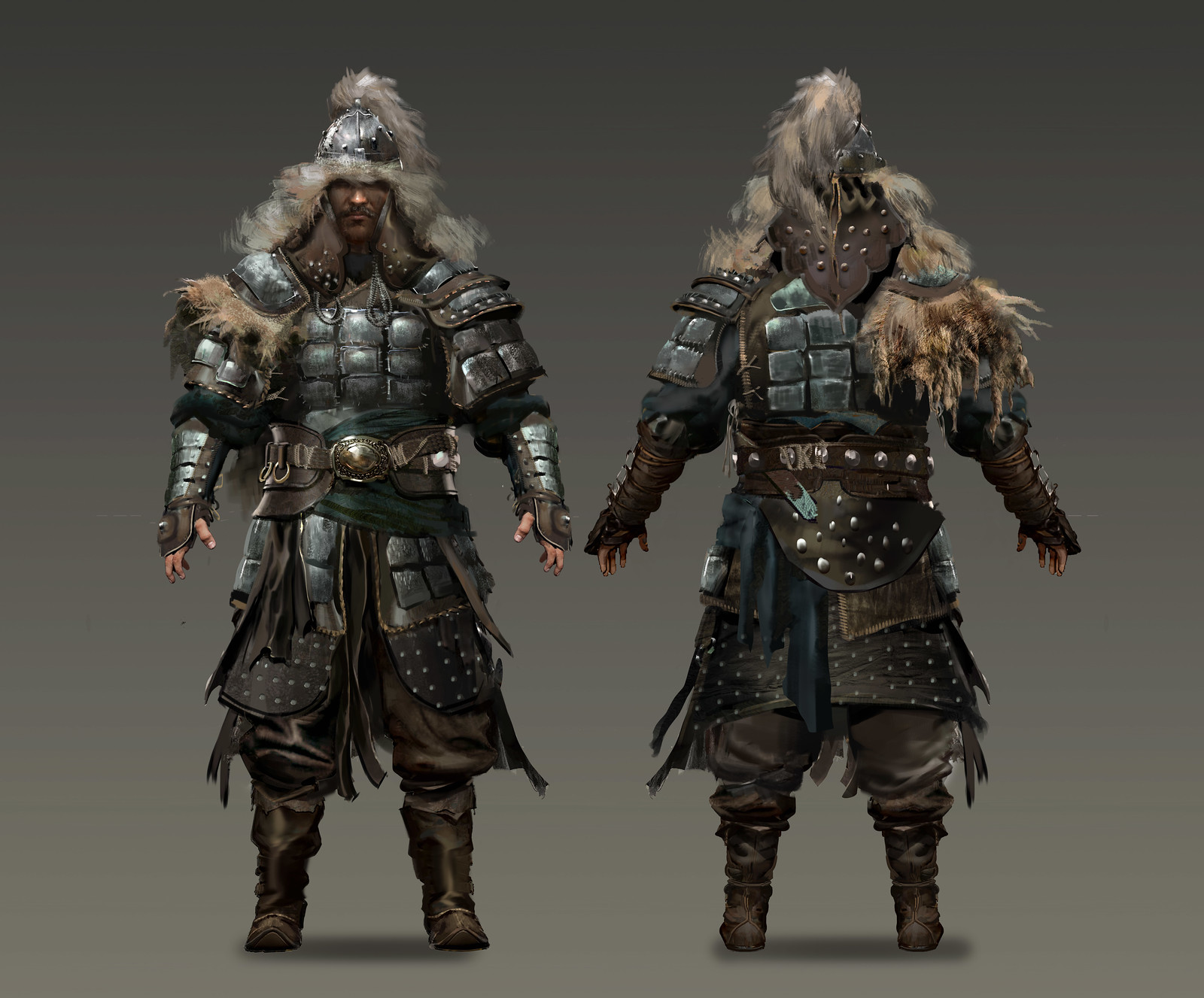
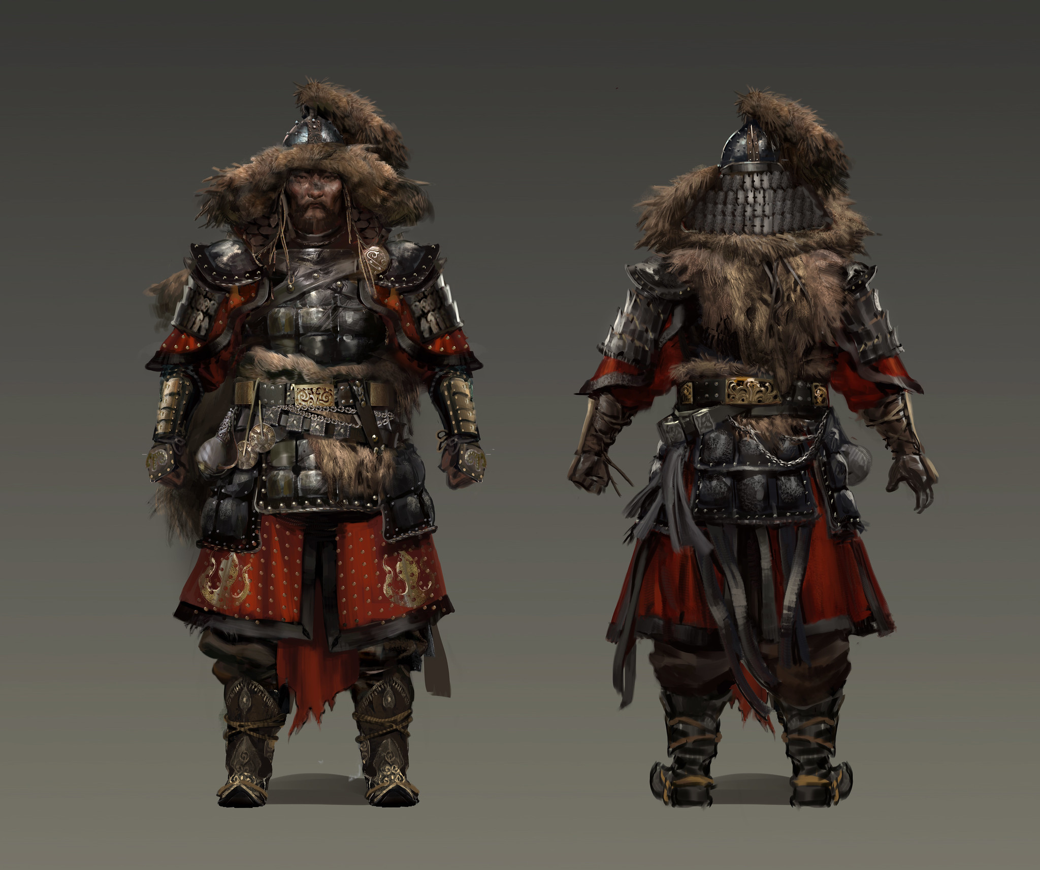
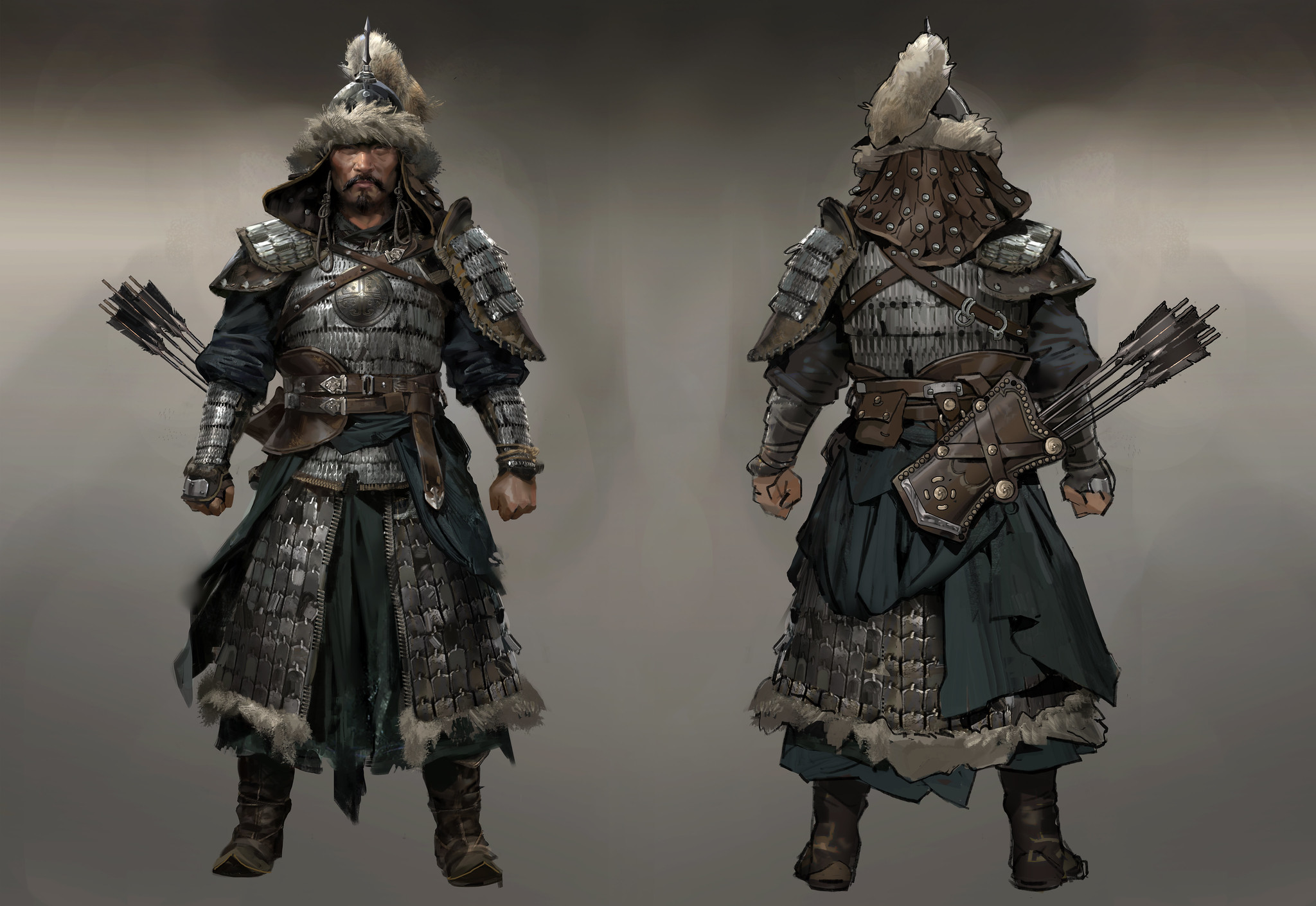
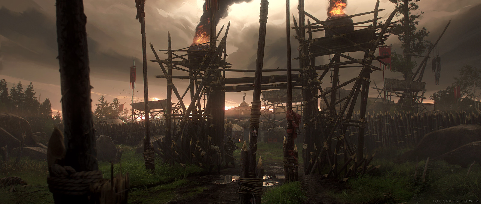
Khotun Khan & His Army
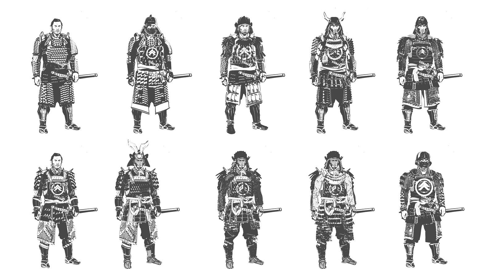
Khotun Khan is an intelligent and ruthless leader, and it was important for us to show it in his design along with his fearsome and menacing force that contrasts with the strict and orderly samurai. The Khan has two outfits. One has a more traditional color palette with organic patterning and aesthetics, and the other, which is more armored, is void of color, with more angular patterns that feel oppressive. The Mongolian army consists of five tribes, and we had to differentiate them across the island and acts. The more powerful the tribe, the more armored and fur-laden they are. This is to show enemy scaling as you play through the game, as well as to consider the cold temperatures of the snowy area of Kamiagata as you get closer to the end of the game. Within those ranks are several classes, each with a unique general silhouette that players can hopefully distinguish from a distance, such as the archer having a more triangular silhouettes, while the brutes had more of a bulky rectangular shape.


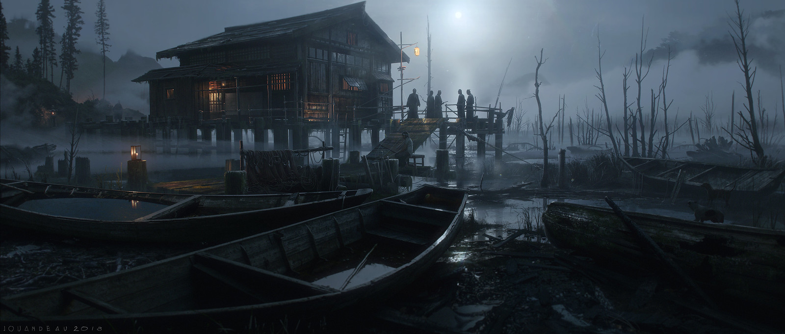
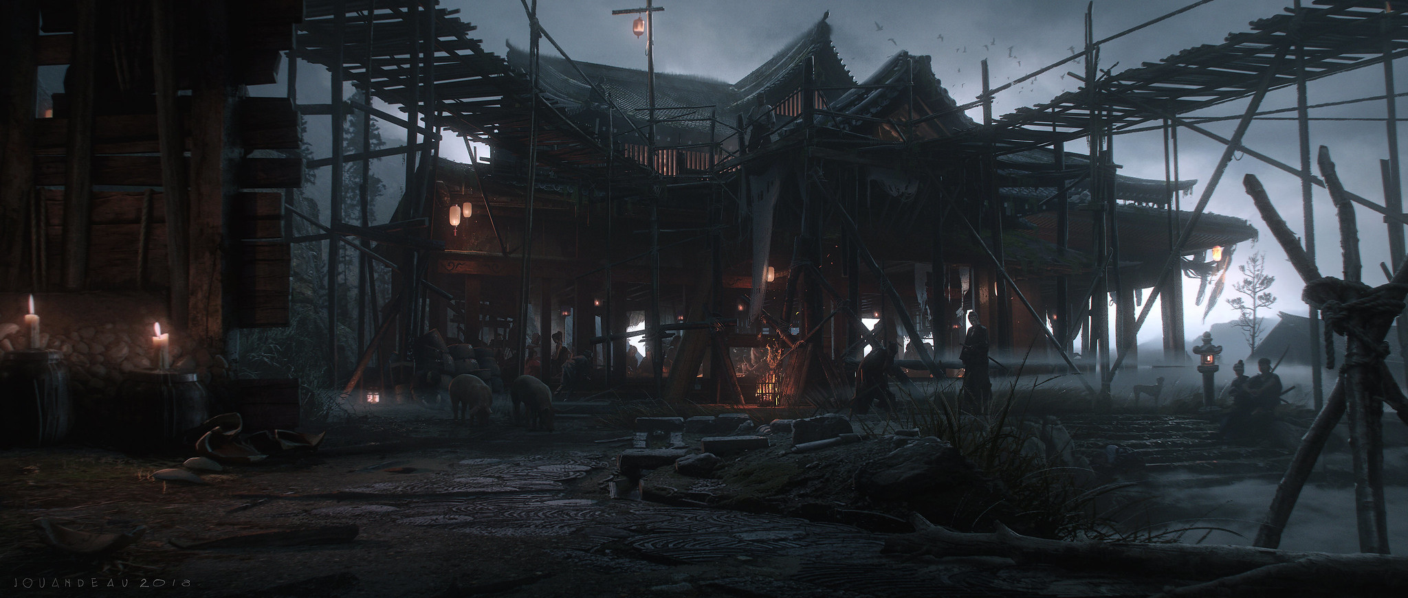
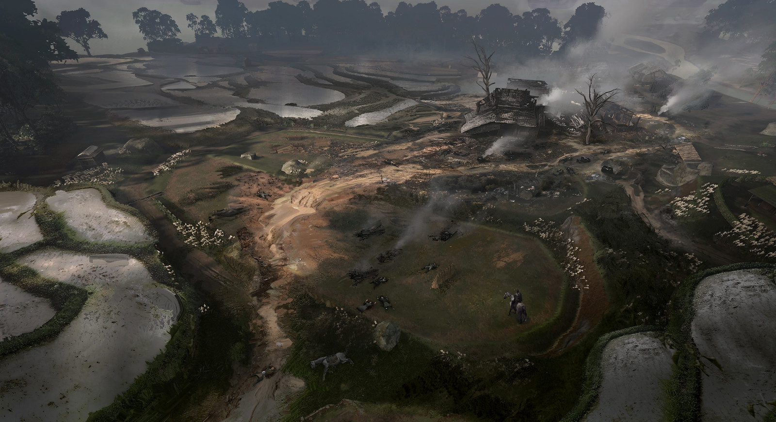
Environments
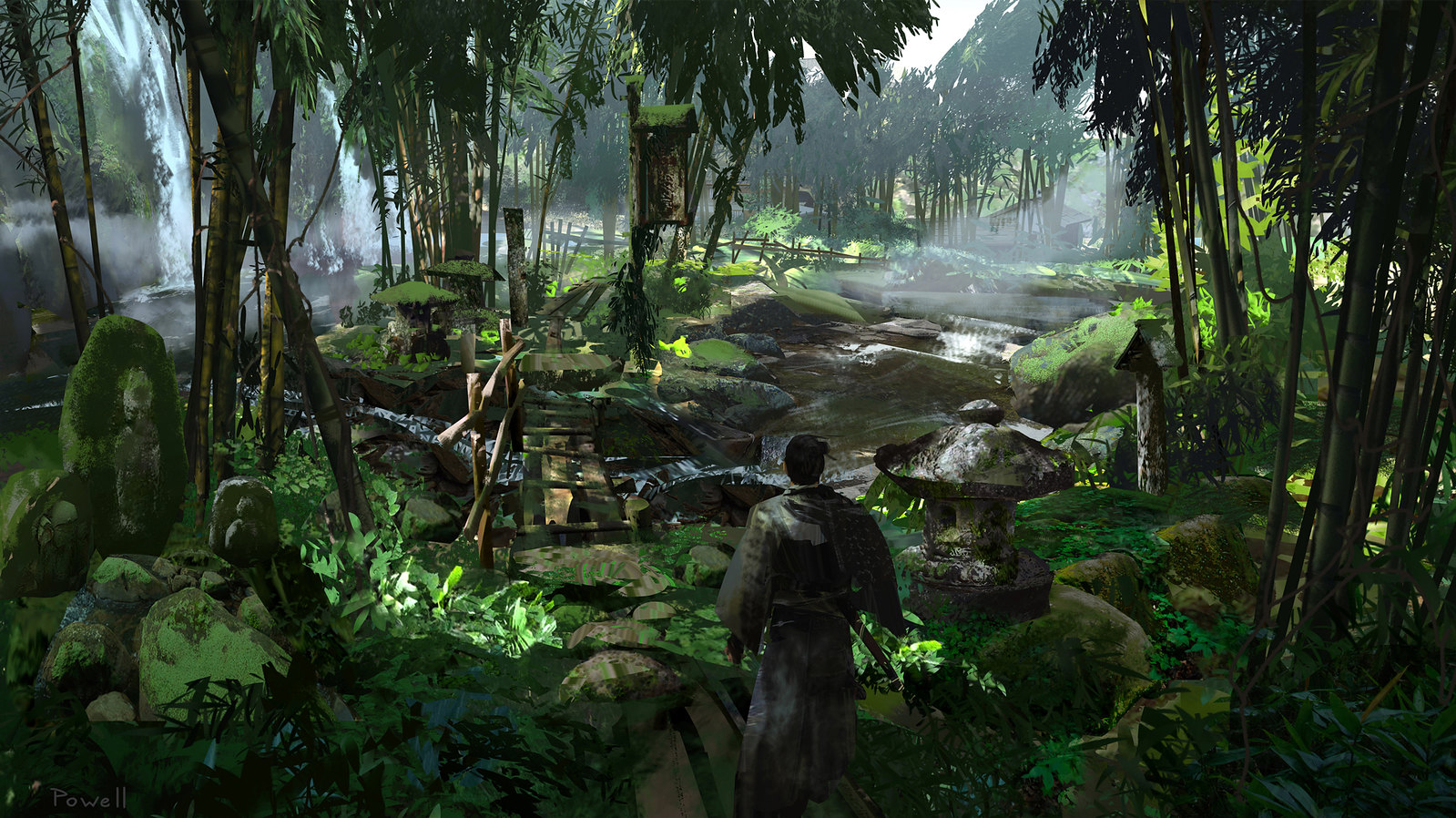
First and foremost, we wanted to create a visually stunning game, and working in a historical setting can often be tricky to find the right balance for accuracy. We always had to think about what to keep historically accurate, and when to break away. ‘Realistic’ is not a word we like using here, our goal was to make sure the game had a sense of style, even though we were making a historical epic. We wanted to create a world that feels like 1274 Japan, but at the same time be more expressive with it. This came in many forms, like bold color choices, stark environment themes, impressive set-ups for the player to stumble upon, etc. In general, what ends up in the game is often a toned-down version of the concepts, so it was important for us to really push and crank up the themes and colors from the concept stage to ensure it was delivered more evidently in the final game.

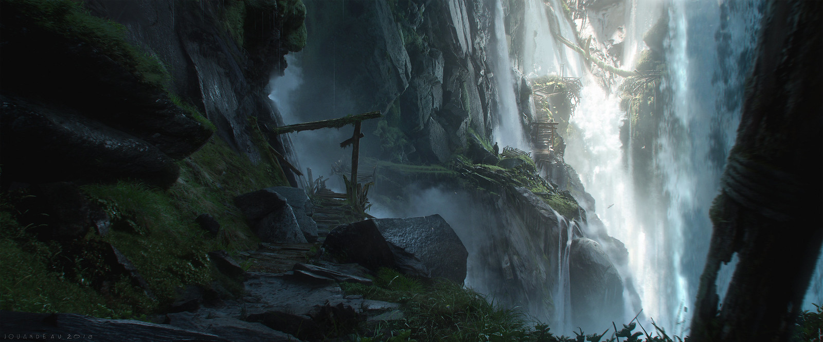

We did a lot of research when it comes to the architecture of the game, from farmsteads, towns and castles to shrines and temples. A lot of the references available online are from later periods and there are not a lot of details on the Kamakura era, which made it a little tricky. We were truly fortunate to have gotten support from Japan Studio as well as cultural experts during production. The Yayoi architecture style in the Toyotama region of the game was unique and hardly seen in other media. It feels very old, ancient looking, and historically works well too since it predates 1274.
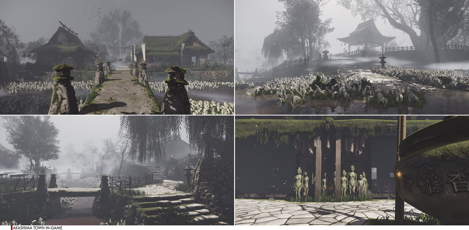
After building a defined architecture ruleset, we used this to then create interesting themes for the towns, such as the medicine town of Akashima, the Straw Hats hideout of Umugi, and the hot springs of Hiyoshi, to name a few. In general, we would start conceptualizing a town by getting the general narrative and theme set, putting together reference and mood boards that showcased those thematic elements, and then starting to concept the general look and feel and mission beats.


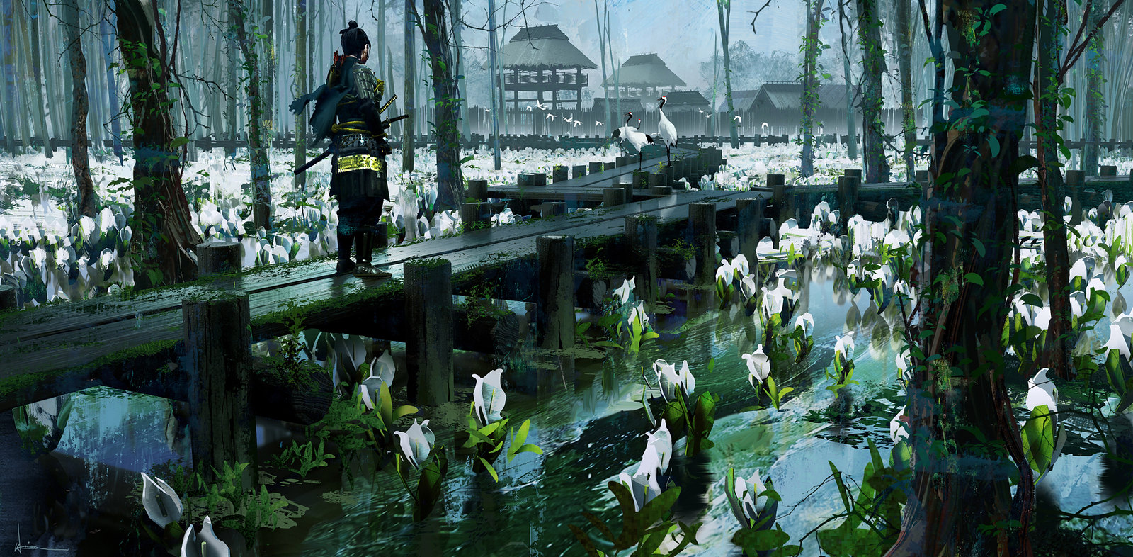
Let’s look at the early development of Akashima as an example. We knew we wanted a town that represents healing with a sense of mystery to its identity. We started brainstorming and hunting down lots of references of traditional ancient Japanese medicines and healing techniques together with interesting rural villages and towns, to then doing visual layouts and concept iterations. We wanted the town to look as if there’s generations of teachings being passed down with a peaceful and serene, yet eerie and mysterious feel. We achieved this by having props and set dressing that evoke those feelings such as the white statues, the paper plastered around the walls, the white stone ground, bird cages, foggy time of day, and having the white skunk-cabbage biome be a part of the town. This all helped emphasize the mysterious and bleached color theme across the town to make it memorable and different from other parts of the game.


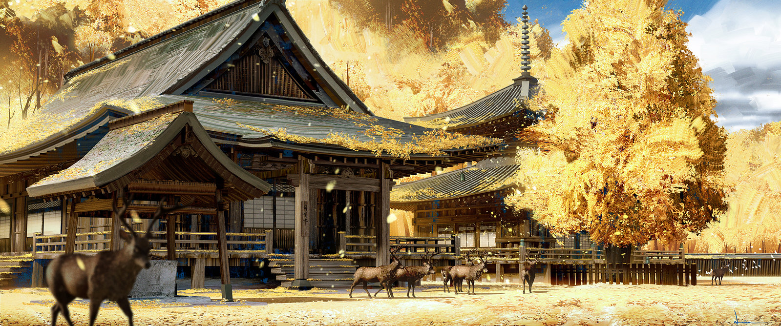
We had the most creative and expressive time when coming up with biome ideas, since biomes, for the most part, are purely for visuals. The concept and environment team came together to brainstorm ideas to help keep each prefecture unique across the island. That involved taking the main key elements of the biome and cranking that up a lot while reducing other less important aspects. This helps make the biome visually striking and memorable, which helps differentiate from other locations. The goal here was to be an expressive art form, and not to mimic what it would look like in the real world.


Mongolian architecture and aspects in the game shows areas of occupancy, which primarily consists of traditional yurts, props & set dressing as well as signs of destruction. Farmsteads and war camps are where we show most of the Mongolian themes and we intend to show oppression towards the population of Tsushima together with scarring of the Japanese architecture and landscape. Examples would be showing trampled grass, ruined rice paddy fields, and destroyed and ransacked Japanese buildings. Most Mongolian assets are quite different from Japanese assets, and mainly consist of wooden makeshift structures, fur, and pelt props as well as their unique banners, to name a few. This creates a strong differentiation when you come across an untouched area compared to an occupied one.


Visual Identity
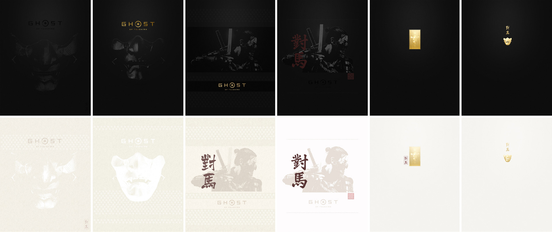
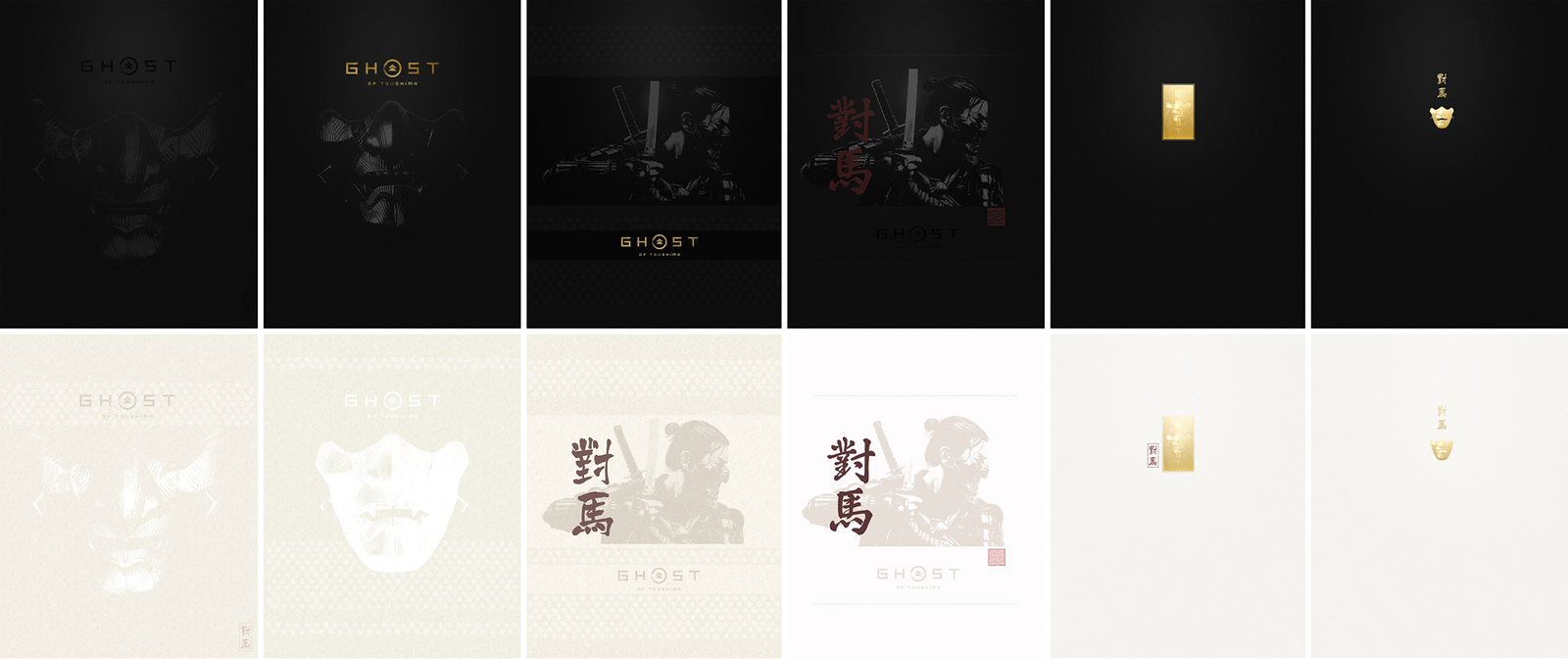
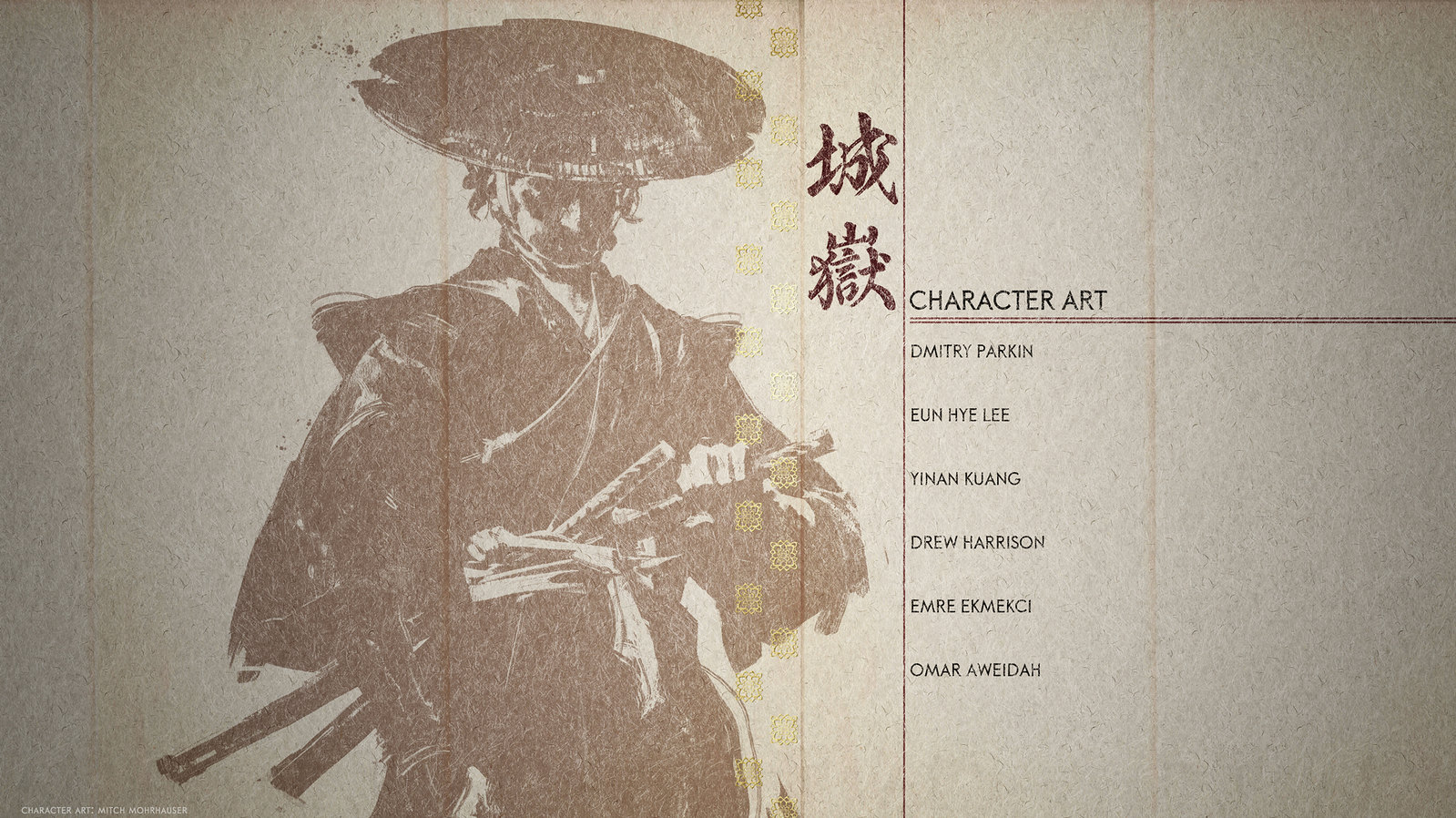
Early on, we knew we wanted to head toward a more modern and classic aesthetic compared to keeping things purely traditional. Old samurai movie posters, modern and traditional graphic design and packaging were key inspirations when concepting early mockups. We incorporated this look into our UI, logos, 2D cutscenes, and even our merchandise and marketing materials. Below are some concepts we explored for the steelbook cover as well as the end credits sequence.


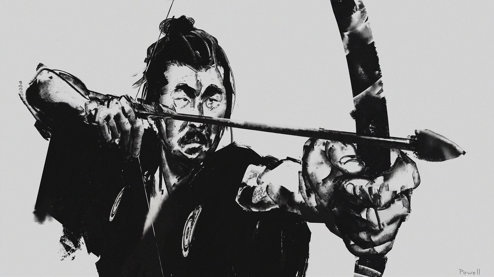
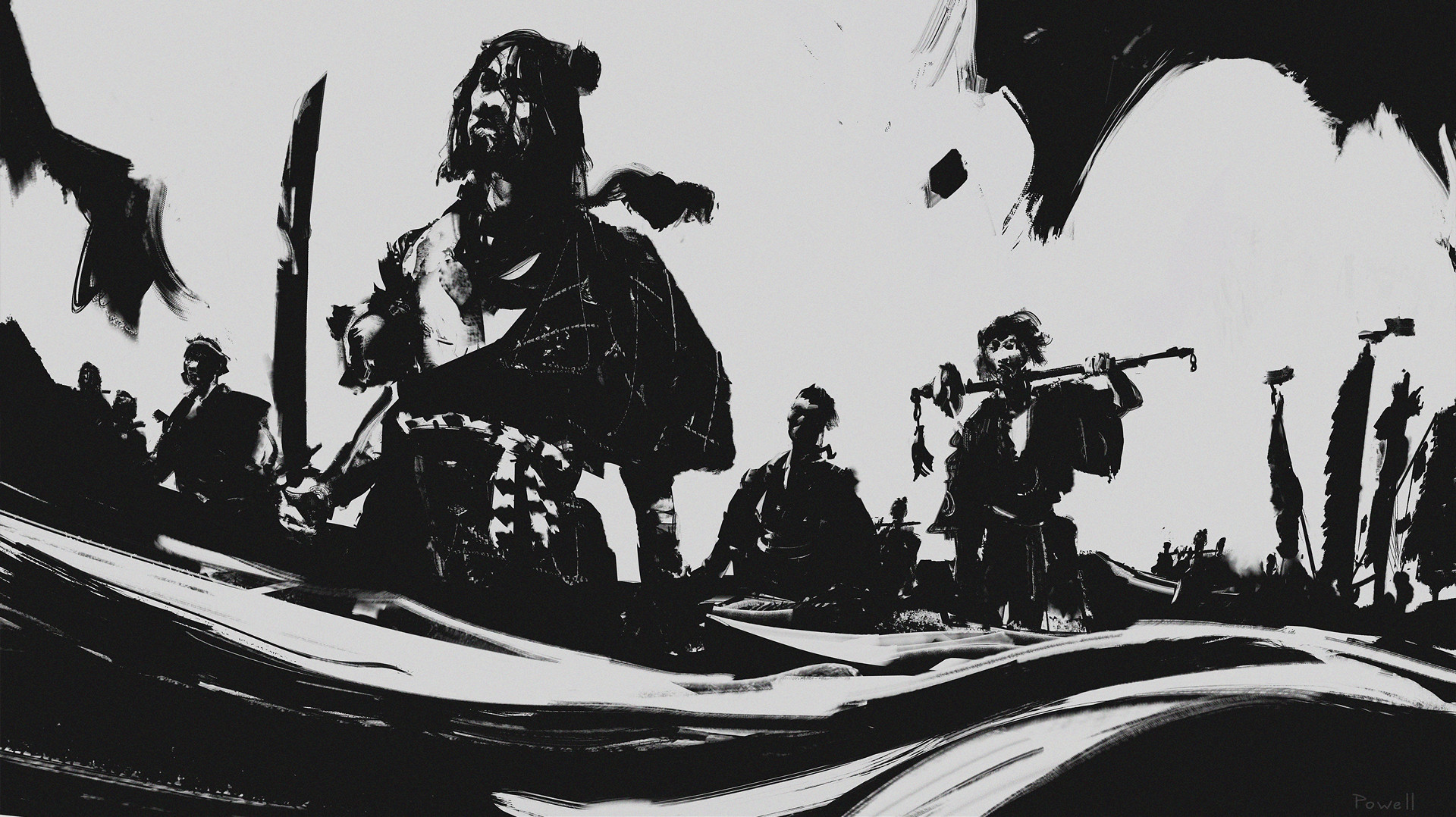
Our 2D ink cutscenes were a fun aspect of the game we worked on. We skewed away from the traditional sumi-e feel and went with a starker and more aggressive look. Using fewer soft edges and thin ink, and more contrast, hard edges, graphic, and thick brush marks. These began with receiving the narrative and script, then storyboarding it out, fully painting each frame, and lastly handing it off for animation and post-production.


Final Thoughts
Concept art is just one part of the entire development process that starts from the very beginning. When designing the look of Ghost of Tsushima, we worked together with artists from various departments and came together to bring our unified vision to fruition. Achieving that vision was a team effort, with talents from 3D character and environment, texture, lighting, tech, designers, animation, UI, visual effects teams, and more.
I hope you enjoyed this little glimpse of how the concept team helped visualize our world of Tsushima!
Website: LINK
