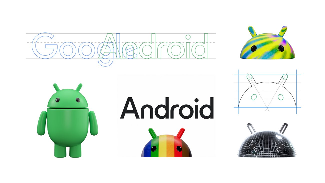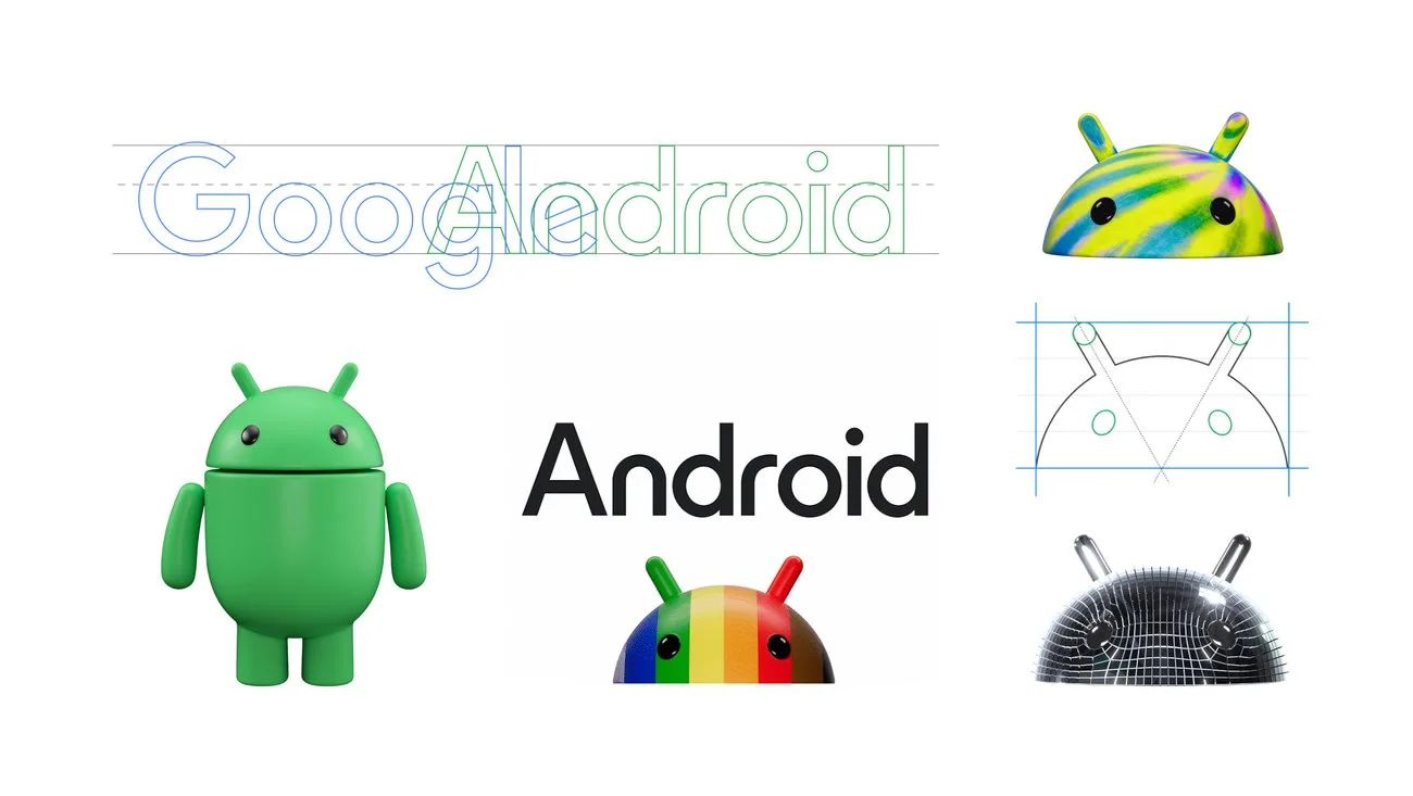
As the world’s largest operating system, Android’s open platform serves a diverse community of developers, device makers and users. And as we’ve grown — with over 3 billion Android devices worldwide — so has our vision. We believe our brand system and how we show up visually to the world as Android should reflect Android’s core ethos of being open, iterative and inclusive. That’s why we’re sharing an update to our visual identity that better represents our Android community — and it’s also a lot of fun, too.
Behind our new logo makeover
Over the past decade, the Android brand has undergone several updates to modernize its look and feel and evolve with the needs of our community. In 2019, for instance, we changed our logo to be more accessible and easier to read. We also updated the naming convention for Android releases from fanciful (e.g., Android Lollipop) to simple (e.g., Android 14), making subsequent releases clearer and easier to understand globally.
Each time we overhaul our branding, we evaluate not only changing needs, but also future goals. We know people today want more choice and autonomy, and we want our brand to be reflective of Android: something that gives people the freedom to create on their terms. As an open platform, it’s important that both our technology and brand are an invitation for people to create, connect and do more with Google on Android devices.
Our new visuals draw inspiration from Material design to complement the Google brand palette, as well as be adaptable. The refreshed and dynamic robot shows up where Android connects with people, community and cultural moments. It can reflect individual passions, personality and context.
With this update, you’ll notice some subtle changes that help connect Android to Google. In addition to moving away from our longstanding lowercase stylization of “android,” we’re elevating the Android logo by capitalizing the “A,” adding more weight to its appearance when placed next to Google’s logo. While we’ve added more curves and personality unique to Android, the new Android stylization more closely mirrors Google’s logo and creates balance between the two. We hope these small but significant updates to the Android typeface will better communicate the relationship between Android devices and the Google apps and services people already know.
Website: LINK

Schreibe einen Kommentar
Du musst angemeldet sein, um einen Kommentar abzugeben.